skerple
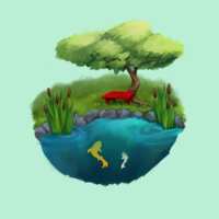
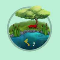
 plurk, tell me which of these three you like best for a card design


skerple
no frame, extremely simple frame, slightly more elaborate ornamental frame (exact frame may vary)
skerple
secret fourth option not currently mocked up: art nouveau
skerple
also, viewing angle. this neutral eye-level angle, a more isometric view, or a lower viewpoint that places you more in the scene?
skerple
(the third option would create some Challenges with some of my planned designs, such as a hedge maze, but it would look real nice for some of the others)
ғᴏxʏᴍᴏʀᴏɴ
hmmmmmm
ғᴏxʏᴍᴏʀᴏɴ
i think i like option 1 or 2 best
skerple
nods
skerple
I think I'm leaning towards option 2 as well
skerple
also: as fun as this was to paint, I think I'll probably go with a more poppy graphic style for the proper set
SariAAAAAAAH
Yeah, I think option 2 is speaking the most to me
skerple
option 2 is also the one that has the most room for subtle embellishments as the cards increase in rarity, if I decide to do that
Remony Atremony
2!
a GHOST
i like 1 but 2 is also v good
Infychu
2
TrueBlueSpark
Also voting 2
zelle bot
I'm between 2 and 3 but I think you changing the frame around on 2 to indicate rarity or whatever would get at what I like about 3, which is the eye being drawn to the contrast of the frame
zelle bot
I don't actually like the frame of 3 as much in style I just like that part of the visual effect
skerple
yeah - 3 wouldn't be the final frame even if I went with it, I just grabbed it as a very quick mockup of "more complex than just circle"
Nancy Crawfish
I like the simple frame
cozy noah
option 2, yeah
Heart Attack 💘
well if 3 is just a mockup that will look better eventually, then I vote for 3
Heart Attack 💘
2 is just a little TOO simple for me, the art is very nice so it outshines the border too much, making it appear tacky
Heart Attack 💘
like they don't go together
we have it all
i think a combo of 2 and 3 would look nice. like if you had 3, but without the banner, just the rope
we have it all
simple shape, but a little more interesting than a plain circle
Autumn Vasch
I like the idea of frame increase due to rarity
Autumn Vasch
but if only one, two
Hamlet 3.3.87
1
Lynx and Paint
option two
corpse bride
option 2
angstspecialist
1st. I like the water color feel
HEY LISTEN
option 2 but i feel like the ribbon from 3 but in the color/style of the 2 border would be good
💕sᴛᴀᴍᴘᴇᴅᴇ💕
yeah I like 2 best looking at these but that's mostly because the contrast on 3 is not doing it any favors, in the same color palette/style a fancy border might look nice
skerple
coming back to this, I'm debating whether to do the gardens in a painterly style or like... isometric pixels
skerple
on one hand, the painting is fun
skerple
on the other hand, pixels
zelle bot
what's easier
skerple
I think they'd both be about equal in difficulty
skerple
so it's more a matter of what would be more fun to do, with some consideration for what would be more popular
skerple
pixels seem to do well and would be fun, and an isometric perspective would also free me up from having to work out the viewpoint for each card