go rimbaud
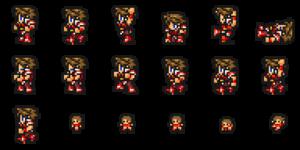
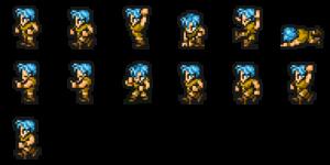
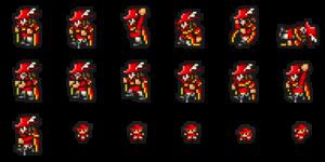
 am i crazy or does this look bad
go rimbaud
like lich looks fine, the background is fine
go rimbaud
but the character sprites leave a lot to be desired
go rimbaud
also that font is horrendous
go rimbaud
maybe it's just that ffrk already has ffvi-style character sprites that remake the old ffi designs, and they look a lot better than this
go rimbaud
and also that this price point is outrageous
go rimbaud
but these new pixel remasters are definitely underwhelming me
stream Huntr/x
Yeah no the sprites look super weird
go rimbaud
plus despite everyone trashing the previous ports of v and vi, (personally i have no problem with the new sprites, though vi's ui change is bad, and i don't like that they made so many of faris' job outfits more feminine) i'm very skeptical that these ones will be better
go rimbaud
though i guess those got delisted so no one can buy them anymore, just the new ones
go rimbaud
which don't yet have a release date
go rimbaud
stream Huntr/x
: i'm not sure if it's the outlines or what, but also all those angry eyebrows
stream Huntr/x
I think it’s both. Like I’m not super good at pixel art, but it feels like the outline is really thick and it flattens everything
stream Huntr/x
The eyebrows def tip it over the line.
go rimbaud
here's fighter and thief from record keeper to compare 

go rimbaud
the generic red mage doesn't have the white hair though,  and they didn't use the classic monk design, i'm realizing
go rimbaud
you don't usually pay a lot of attention to the generic classes in ffrk because you usually use the actual characters from ff games instead
go rimbaud
one noticeable difference in the outlines here is they don't just use them on the outside, it bleeds in to help define some of the...inlines? and shading as well
go rimbaud
i think that's more the issue than thickness, since they look like they'd just be one pixel thick at the resolution those sprites must've been worked on
go rimbaud
i've never been good at pixel art either though, and it's been like twenty years since i've even tried
go rimbaud
though back then most of my goals were in trying to make stuff like 2d final fantasies, and outlines were also one of my weaknesses
go rimbaud
so making something that looks like what i might've made is a red flag
ᴇᴠᴇʀ🧋
It's not just you
ᴇᴠᴇʀ🧋
It's wild that Square's got this amazing library of games, very beloved, and they've done so many incredibly half-assed ports.
go rimbaud
it just keeps happening
ᴇᴠᴇʀ🧋
I picked up the SaGa Frontier remaster recently, only to discover they made a mobile port...
go rimbaud
and i'm still waiting on tactics to get ported to some modern platform other than mobile too
ᴇᴠᴇʀ🧋
...and then they ported the mobile port to Steam/Switch.
ᴇᴠᴇʀ🧋
And left in the mobile controls.
go rimbaud
so the same thing that happened with vi and chrono trigger, huh
ᴇᴠᴇʀ🧋
Yep.
go rimbaud
except it also made it to switch
ᴇᴠᴇʀ🧋
Yep!
go rimbaud
the old steam port of v was also a mobile port, but somehow it escaped all the ui struggles that vi and chrono trigger had
go rimbaud
like i was a little surprised how unfucked the ui was
ᴇᴠᴇʀ🧋
The fact that it's a pattern that's spanned years is just.
go rimbaud
it's bad
go rimbaud
they should be ashamed
ᴇᴠᴇʀ🧋
But they're not as they keep doing it.