
TENNA.
i liked my sketch ver / even slightly edited ver more because now ir seems like theres barely any effort put in it 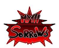 <- handwritten text color preview they didnt like at all
 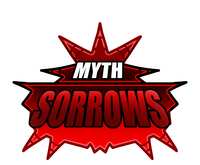 slightly colored ver

taco
i like the 1st one
TENNA.
i Liked it too abut i Think they thought it was ass FUCKKKKKK
TENNA.
this is For a Roblox game Also
taco
they are stupid
taco
the 1st one is so much easier on the eyes and its way more creative

⠀⠀
is it possible to rework the first one like taco i believe its more visually pleasing however some of the letters being outside of the icon i can immediately pinpoint so make sure thats like perfectly aligned after final version
taco
i lowkey ljke that its outside the icon its peak when people do that
TENNA.
I honestly was going for the outside the icon look GUH
TENNA.
i can rework that though
TENNA.
in their sketch version they had it like that too so i was like hnrnrnrnr
taco
these guys are so BORING!!!!
⠀⠀
IT COULD JUST BE ME BUT IT FEELS OUT OF PLACE TO ME cause its like. only1 letter peeking oit and not both the start letter and ending letter ohhh
taco
i think that could just be fixed by moving sorrows a little to the right
taco
or making it slightly bigger
taco
or longer
TENNA.
aye aye
TENNA.
i think maybe Their design is also ok because maybe it needs to be simple to be read well in the game list but also
TENNA.
i feel like that doesnt fit the retro roblox kinda style they were going for?
⠀⠀
this is what i mean whoops  myth is like. perfect there its nice to look at but the Sorrows does not align for me
TENNA.
oh Yeah i get that i was in Hell trying to make rhe sorrows look nice H
taco
the w and the s look slightly squashed too
TENNA.
🫡
TENNA.
again rhis was just a color preview so
TENNA.
was nawt really trying H
taco
but i truly think they are missing out not using the first one idk the second one seems so much more dead and flat to me
taco
it looks like a newgrounds logo
TENNA.
maybe thats the vibe theyre Going for ....i will be silent until more things are said
TENNA.
whatever im gettinf paid anyway 🥶🥶🥶🥶
⠀⠀
yeah exactly provide input but if they dont want peak then oh well youre just doing your job some people are like that unfortunately
TENNA.
Truth...