BWAAAAAH!

BWAAAAAH!
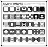
From the movie Alien
BWAAAAAH!
they made little infographics for the ship
boo(f)
that's so FUCKING cool
skerple
oh that RULES
BWAAAAAH!
it looks official
BWAAAAAH!
like you can imagine that regular travelers of the stars know all these by heart
BWAAAAAH!
I should watch Alien again
BWAAAAAH!
and Aliens
CrowsbeforeBros
oh that's neat
big juicy
god this looks SICK
big juicy
designer brain is looking at this tho and wondering if all the various storage icons pass color blindness tests for making sure each is universally distinguishable from each other
BWAAAAAH!
yeah
izzy.vrm
the coffee icon...
Echo
Hmmm, good question. Looking at it, the only ones that seem to share the same exact shape are the last three- storage versus organic/foodstuff storage versus refridgerated organic/foodstuff storage.
Echo
I don't know if blue is normally affected by colorblindness or not, but the green square in the middle might be a problem.
Echo
Still, the rest are all visually distinct from each other even without the colors, and these three don't seem like it would be actively disastrous to mix up with each other- you'd just have to go 'hm okay is this the storage closet, the pantry, or the fridge', which is probably something you can just check without it being dangerous or time-critical.
Lightning Bolt
could still be annoying if they're really far from each other and you made a mistake about which way to head at the start
Dead Mentors
 values are noticeably different, so I think they're good for colorblindness
boo(f)
yeah, colorblindness is about making sure the greyscale values are notable different or distinct, as I have learned partially in my line of work intersecting with it
boo(f)
so those look like they'd be fine to me
big juicy
hell yeah, noice