
boodle boy
I need everyone’s help and eyeballs, please! I’m tying to pick a font treatment for my graphic novel pitch...images below!
boodle boy
fermentingbones
whipped up some graphic design for logo treatment for me and I like them all and wanted to get some other feedback on them! The image is not 100% final but it’s mostly what it’s going to look like
boodle boy
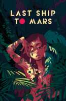
Option A: 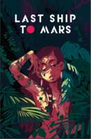
boodle boy
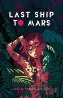
Option B: 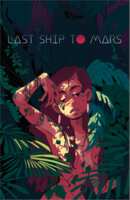
boodle boy
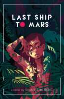
Option C: 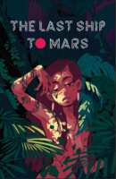
boodle boy
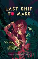
Option D: 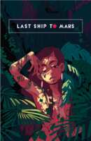
boodle boy
Presented in no order
boodle boy
For context this is for a mock cover proposal, so imagine you’re looking at a book cover. What version do you like best?

Falcon McRaven
I prefer A or C, though with C that I think the solid red circle on C is a little too heavy and if it were outlined like the text it would be more cohesive without loosing the color emphasis.
Falcon McRaven
I also like D but it feels a little small compared to the amount of space around it? I like the stacked title since it fits nicely in that space
Falcon McRaven
Oh I just noticed the title on C is different, was that intentional?
boodle boy
Yes but it might have to change....I’ve been going back and forth on “the” or not and l think I prefer no the
boodle boy
Also thank you! That’s REALLY helpful feedback

enLightened
I like A the best, i like how the text stands out, the text on D feels a little small to me
Falcon McRaven
 Happy to help, this is looking awesome!!

Mothman
I really like the font for A best, it's really eye catching
enLightened
but the font on B is really cool...

Peil Wiggler
I really like A
Peil Wiggler
also like it without the "the"
Peil Wiggler
also this looks fuckin awesome
Falcon McRaven
 What would you think about using the lightest color in your illustration instead of the white? I love the contrast but it feels really stark, especially with the heavier type treatments.

[[BIG SHOT]]
A or B, with a preference for A. Easier to read, and it's very stark in comparison to the heavy detail in the picture, which works nicely.
[[BIG SHOT]]
GORGEOUS art too
boodle boy
THANK U GUYS

🐅 its harry
i agree w lex!
boodle boy
Definitely leaning toward A which seems like a lot of people are as well
boodle boy
I feel like they all have their pros and cons but I want whatever grabs the eye best without too much thought
boodle boy
We are still gonna make some little tweaks based on what people are feeling so this is all good
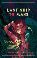
boodle boy
boodle boy
Looking gooood 
Falcon McRaven
OH I love that second one!!!
Falcon McRaven
The plants in front of the frame is extremely good!
🐅 its harry
oOooh

fermentingbones
I;m here I'm implementing changes as we go -- lex, really love the Lightest Color suggestion! It's not final art so i'm not 100% sure what colors will be, but i'm gonna use that!
fermentingbones
fermentingbones
I love that look!
fermentingbones
THANK YOU FOR ALL THE FEEDBACK EVERYONE
fermentingbones
can't decide yet to go with the frame or just the stark, but I'm thinking white if it's a frame or yellow if it's not
fermentingbones
i'm really leaning towards frameless
Falcon McRaven
Yeah having the frame around it helps draw your eye down to the bottom which I think helps with the strong contrast.
Falcon McRaven
And it compliments the lighter weight font at the bottom! But they are both good options
[[BIG SHOT]]
love the framed one
fermentingbones
these are extremely good thoughts and i'm gonna go with that and stop second guessing myself
fermentingbones
gonna marry the two thoughts and give it a looksee
fermentingbones
fermentingbones
thinned out the frame weight, which i think helps my misgivings with it
fermentingbones
Falcon McRaven
: thank you for lending your design expertise it is VALUED AND APPRECIATED
fermentingbones
and to everyone else too!!
Falcon McRaven
I like the thinner frame too!
Falcon McRaven
Also you are most welcome! I am happy to assist and glad that it helped!!

Legosi
Ohhhh yeah, love the thin frame one!

coochie scarf
uh, wow,
Falcon McRaven
actually summed up my thoughts exactly, so uh, ditto?